Don’t forget your Logo background color
09 Oct 2012 by Nigel SampsonIn continuing with the previous post on things to watch out for when submitting your Windows 8 app to the Store. If you browse through a category (Games seems especially affected) you’ll notice a lot of drab grey tiles for the apps. Combined with dark text gives you a tile that does the opposite of drawing attention to the app you’ve spent weeks lovingly creating. If you then click through to the app details you can see the background and text colors are repeated in the left hand sidebar, Very unappealing.

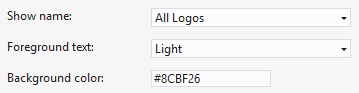
So where does this color come from? Just like the store logo its set in the Package.appxmanifest file, this time under the Application UI tab as the Tile Background color with the default color is the drab grey (#464646). A lot of apps will use full size icons so don’t feel any need to change the color from the default, as you can see it’s very necessary! The text color in the Store comes from the Foreground text dropdown, giving you the options of Light or Dark text (defaulting to Light). The important point to note that this affects both the color the text on your app tiles on the Windows 8 start screen as well as in the Store so you’ll need to think about how the text will look on both your logo as well as the background color in the Store.